

Image
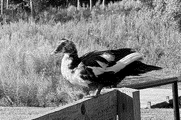
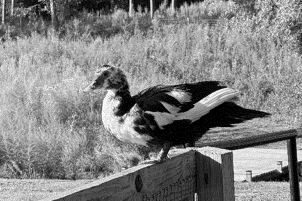
Place images on a screen and control their size, object fit, and inversion. On 1-bit displays, dithering arranges black and white pixels so an image still reads as shades of gray.
Dithering
Add image-dither to a raster image to have it
dithered to the screen's palette. The dithering itself is a platform behavior: TRMNL applies it when it
renders the screen.
You mark the image and the platform dithers it to the target device's palette at render time.
You dither the image yourself before you serve it. A released build from the CDN and a build compiled from this source both ship the same CSS, and neither one dithers.
<!-- Full-color source, dithered by the platform -->
<img class="image image-dither rounded" src="path to the image file"><!-- Pre-dithered source, served as-is -->
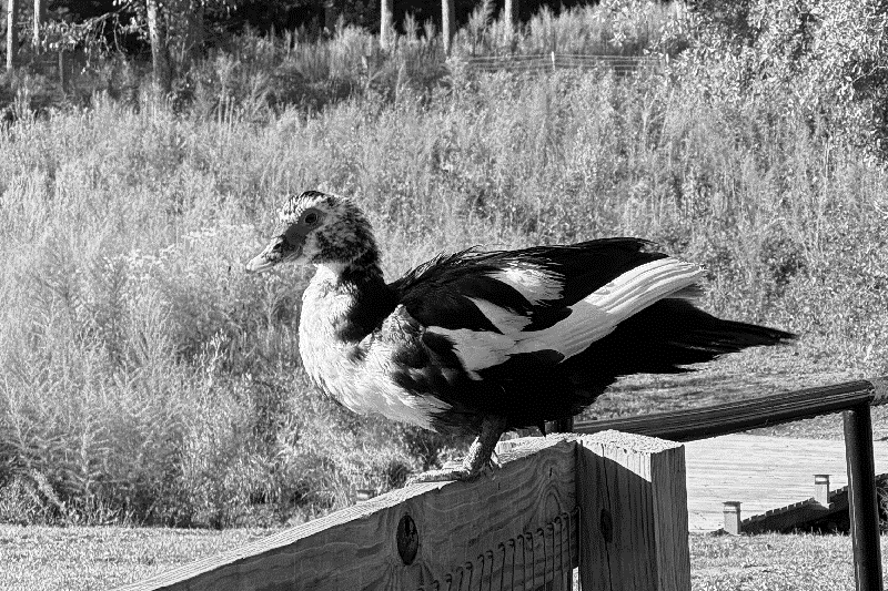
<img class="image rounded" src="path to the dithered image file">The demo below picks a source photo per bit depth with visibility utilities; every other mode falls back to the full-color source. The docs preview simulates the dithered look with a docs-only helper, so it approximates what the platform renders.
 Dithering
Sizes
Two utilities cap the width of an img that
carries the image class:
image--small at 80px and
image--xsmall at 40px. Both follow the screen's
content scale, and both set a maximum, so a narrower source keeps its own width and the aspect ratio is
never touched.
For any other dimension, use a width or height utility from Size Size Define exact width and height dimensions for elements Utility classes for width and height. Fixed sizes, arbitrary values, dynamic sizes, and container query units, each also available as a min or max constraint and with responsive variants. .
image--small
image--xsmall
Image
Sizes
<img class="image image--small" src="path to image">
<img class="image image--xsmall" src="path to image">Object Fit
Control how an image fills a box whose aspect ratio differs from its own.
Options
- Fill: The image is resized to fill the given dimension. If necessary, the image will be stretched or squished to fit.
- Contain: The image keeps its aspect ratio, but is resized to fit within the given dimension.
- Cover: The image keeps its aspect ratio and fills the given dimension. The image will be clipped to fit.
Fill
Contain
Cover
Object Fit Options
<img class="image image--fill" src="path to image">
<img class="image image--contain" src="path to image">
<img class="image image--cover" src="path to image">Invert
Use invert to flip every pixel to its
opposite: black becomes white, white becomes black. It rescues artwork authored for the opposite
background, such as a white-on-black glyph placed on a light screen.
It composes with Image Stroke Image Stroke Legible images when displayed on shaded backgrounds Outline a vector or transparent raster image so it stays legible on a shaded background. Set the stroke width and color with the image stroke utilities. . The pixels flip first, so the stroke keeps the color its shade modifier names.
Original
Inverted
Invert
<img class="image invert" src="path to the image file">Adaptive Icons
Use image--adaptive to recolor a monochrome
silhouette icon in the screen's icon color. Only the icon's shape is used: its own pixel colors are
ignored. The color follows the device, Raw/Preview, and the active theme, exactly like
framework text, so one set of icons works everywhere.
The icons below are SVG silhouettes from the plugin weather set, originally solid black glyphs on a
transparent background. A PNG with transparency works the same way, since only the alpha shape is read.
To watch them adapt, switch the device or Style in the screen picker (top right): the icons
repaint to match the screen, while a plain image
would keep its original pixels.

 Adaptive Icons
<!-- Monochrome silhouette icon (shape on a transparent background; SVG or PNG) -->
<img class="image--adaptive" src="path/to/icon.svg">

<!-- Without the framework JS runtime, arm the icon manually -->
<img class="image--adaptive" data-adaptive="true"
     style="--framework-icon-src: url('path/to/icon.svg')"
src="path/to/icon.svg">How It Works
- The framework runtime (
plugins.js) reads the icon and hands it to the stylesheet as a mask; CSS supplies the paint. - The icon color comes from
--framework-semantic-icon-{color,image,under}. By default it matches the primary text color; a theme overrides it withtheme-slots.semantic-icon. - Silhouettes only. The image is flattened to its alpha shape, so never use it on photos or multi-color logos; use Image Stroke Image Stroke Legible images when displayed on shaded backgrounds Outline a vector or transparent raster image so it stays legible on a shaded background. Set the stroke width and color with the image stroke utilities. to keep those legible instead.
- Composes with
image-stroke(the stroke outlines the recolored shape). Not meaningful withimage-ditherorinvert.
The icon must be readable by CSS. Recoloring uses a CSS mask, which the browser
only permits for same-origin icons or hosts that send
Access-Control-Allow-Origin. An icon on
an arbitrary third-party host stays a plain image in its own colors. Serve recolorable icons from
your own origin, or inline the SVG with
fill="currentColor", which recolors with
no classes and no hosting constraint.
Related APIs
Adaptive icons under themes
An icon carrying image--adaptive is repainted with
the screen's icon paint, keeping only its alpha channel, so it follows the active theme with no markup changes.
Pick a Style in the screen picker to watch the icons on this page repaint. See
Themes
Themes
Visually customize any plugin with a drop-in stylesheet that recolors the whole screen
Themes are a simple way to visually customize any TRMNL plugin. A theme adjusts the framework's colors (backgrounds, text, borders, chart colors) without touching plugin markup, and gracefully adapts to every supported device, from 1-bit ePaper to full color.
for what else a theme re-points.